
What Wimbledon Can Teach Us About Brand Consistency
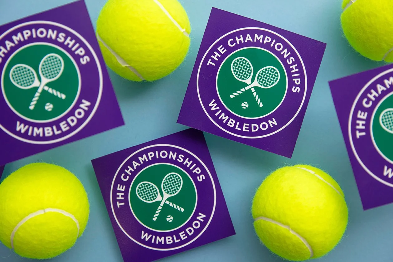
Image: ink drop - stock.adobe.com
What do you think of when we say grass courts, crisp whites and the occasional royal patronage?
Instantly, you know it’s Wimbledon.
Whilst many other branded sporting events are busy launching another new visual identity or pushing a ‘bolder’ tone of voice, Wimbledon has spent decades doing the opposite. Instead, it has carefully knuckled down on its own set of distinctive assets – colours, traditions and even the strawberries and cream. Most of these elements aren’t remarkable on their own but their consistent use has helped Wimbledon to become the most recognisable grand slam.
The lesson for marketers is that every time your look and feel changes, you’re asking the audience to remember you all over again. Brand consistency is about making it easier for people to recognise you, and in turn buy you.
Ironically, consistency can feel boring to those who need to implement it. Marketing teams tire of the same colours, designers crave something new or executives want a "refresh", but customers aren't involved in your brand every day.
So, before you redesign your distinctive assets, ask yourself one question:
Are customers bored of it, or are we?
Because if Wimbledon swapped out it’s white, would it feel like Wimbledon?